Design with
EDGE.
How to create high-impact designs using AI — without looking generic. Not a tools workshop. A thinking workshop.
"AI has made design faster.
Not better."
"The difference between AI output and great design is not which tool you use. It's the thinking before you open the tool."
— Core premise of the workshop
The EDGE Method™
Four steps that separate designers who use AI from designers who are replaced by it. Most people skip the first two — that's why their work looks the same as everyone else's.
Context before creation. Most people skip this — that's why outputs feel random.
Taste before tools. AI cannot generate taste — you bring it.
Prompting is not typing. It's direction. You instruct — AI executes.
AI gives the draft. You create the finish. This is where design actually happens.
AI is the tool.
Direction is
the advantage.
I use AI as a structured execution partner, not a shortcut. My workflow is built around tools for thinking, prompting, and visual generation. The goal is not to rely on tools — but to control them with clarity and intent.

Design, Strategy,
and Execution.
I have 7 years of experience in design and marketing, working with clients across India and 5 international markets. My work focuses on creating strong visual systems that are not just aesthetic, but effective. I prioritize clarity, execution, and results — not just ideas. With AI, my approach remains the same: control the output, not depend on it.
60 Minutes.
Deep dive.
No fluff.
Every minute in this workshop earns its place. You'll leave with a framework you can apply the same day — and a live demo you can steal from.
Same AI.
Different thinking.
The difference between generic and intentional isn't the tool. It's what happens before you open it.
Designs from the Workshop
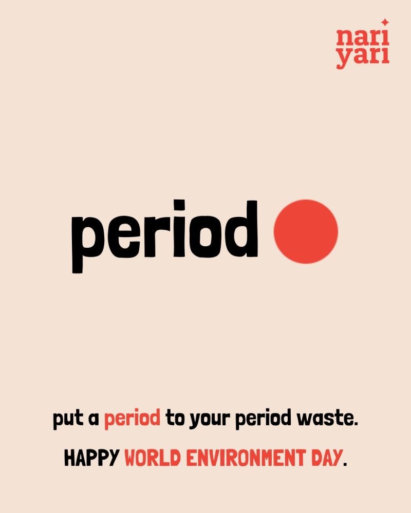
Real briefs. Real outputs. This is what the EDGE method produces — bold, intentional social posts for Nari Yari, a period-care brand.
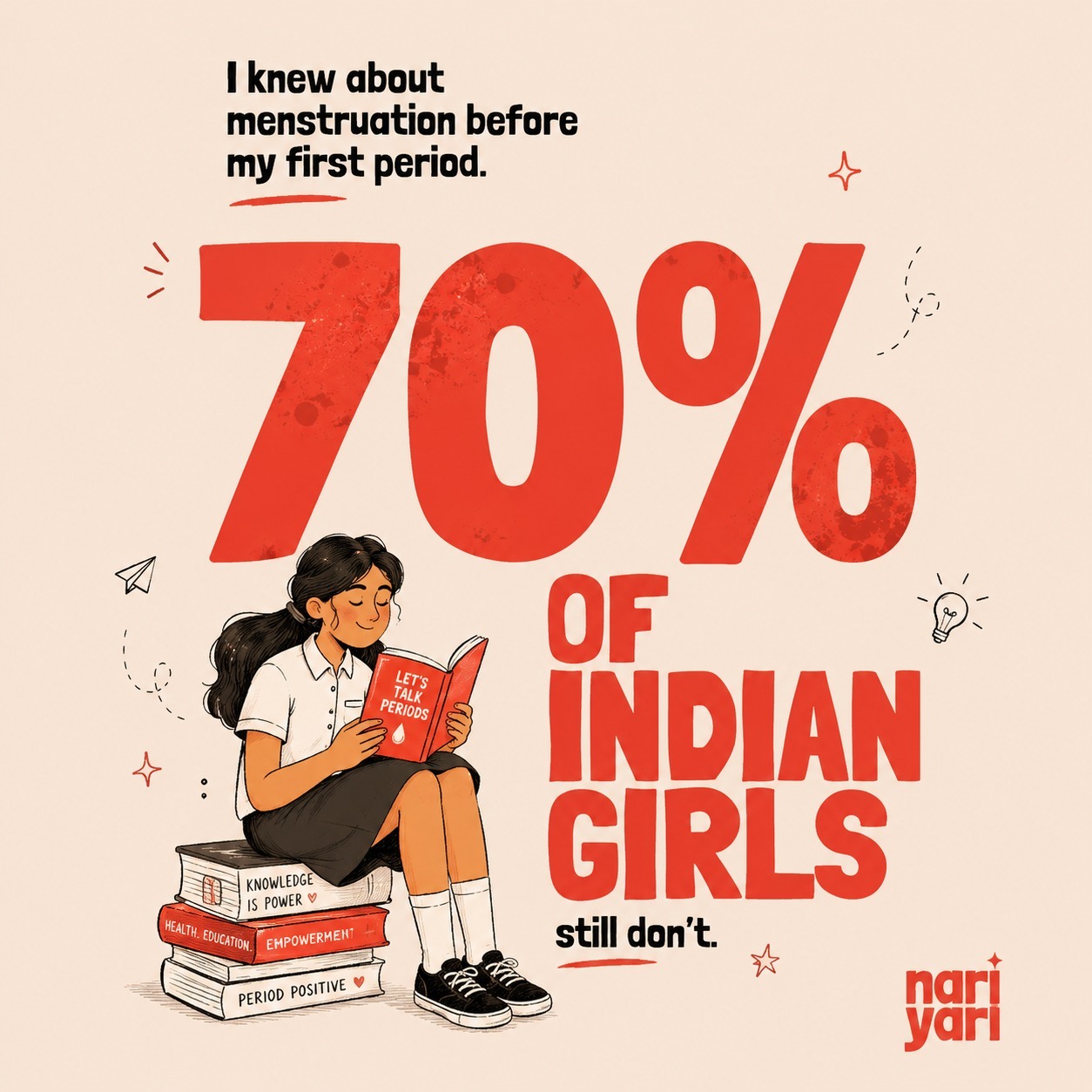
Loud Statistic, Quiet Impact
A generic, data-heavy visual that states the problem but lacks emotional connection, brand identity, and storytelling. It informs, but doesn’t truly engage or stay with the audience.
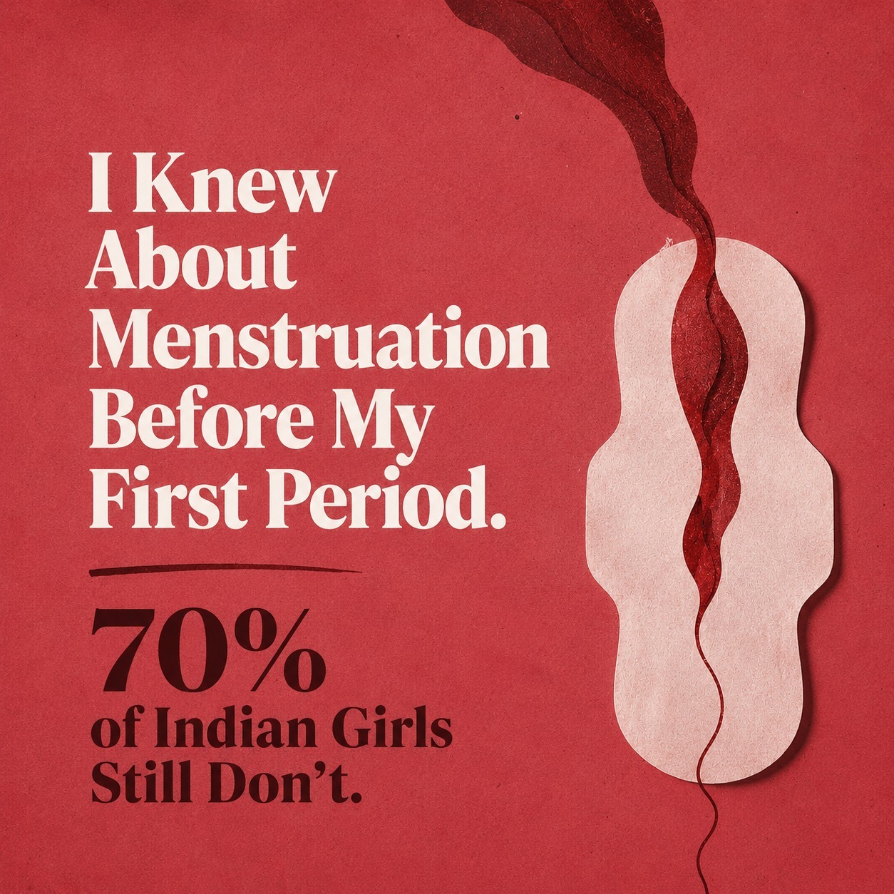
From Data to Emotion
A bold, empathetic visual that transforms the same statistic into a relatable narrative. Strong branding, minimal design, and symbolism make the message more human, memorable, and shareable.
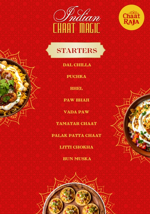
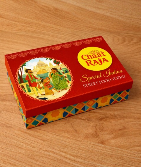
Decorative, Not Distinctive
A visually busy layout that relies on generic patterns and food imagery. While it lists items clearly, it lacks cultural depth, storytelling, and a memorable brand identity.
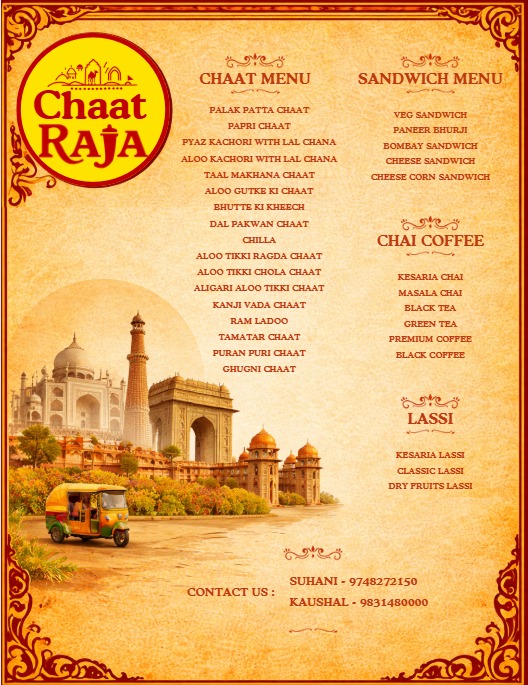
A Menu With a Sense of Place
A thoughtfully crafted design that blends culture, context, and cuisine. With strong visual storytelling and local elements, it transforms a simple menu into an immersive brand experience.
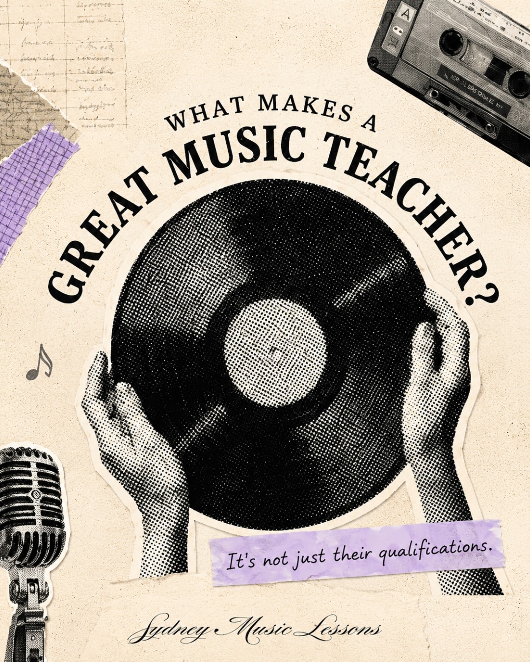
Selected Work
Get the EDGE Prompt Structure
Register and attend the live session to receive the full prompt framework used in the demo — copy it, adapt it, and use it on your next brief the same day.
The future is not AI vs designers.
It's designers who know how to use AI — versus those who don't. Come learn the difference.
Reserve my seat →